
Web Design and MarketingSunday, August 02 2015
 It's important that images are sized correctly before they are uploaded to your website. There are two aspects of an image to be concerned with.
The dimensions are 3264 pixels x 2448 pixels. To give you an idea how big that is, the dimensions of cover photos on Facebook is 851px x 315px. Our sample image is almost 4 times the width of a Facebook cover image. Usually once we take care of the dimensions, the width and height of an image, that will take care of the file size as well. I normally use PhotoShop to resize images. I'm assuming that if you have PhotoShop you already know how to resize images. So for this demonstration, I'm going to use PicMonkey a free online tool to show you how to resize images for your website or blog. The basic editing features are free with PicMonkey. You can upgrade and get access to all of the PicMonkey tools. If you're going to be working with images and you don't have PhotoShop, I recommend you get the paid version. I have PhotoShop and I still use PicMonkey quite a bit because it's so quick and easy to use. 4 Easy Steps to Resize Your Image for the InternetStep 1: Go to PicMonkey, click on the Edit icon at the top, then click on Computer under the Edit icon. Then choose the file that you want to resize.
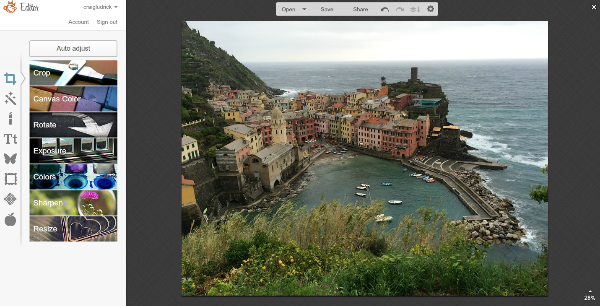
Step 2: Notice in the bottom right corner that the image is displayed at 28% of it's size. It's so large it can't fit on the screen.
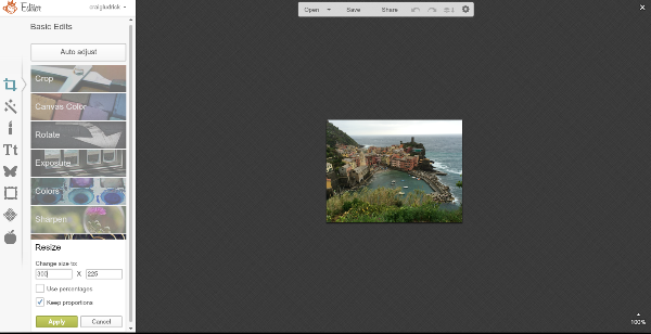
Step 3: Enter in your new pixel dimensions. If your not sure, see my note below to help you get an idea.
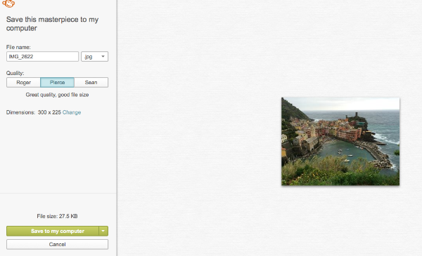
Step 4: In the first box, you can rename your file and select file type. I recommend you save it as a jpg.
What if I'm not sure what pixel size my image needs to be?If you're new to working with pixels here are 2 ways to find out the dimensions of an image on a website. By looking at the size of images already on a website you'll get an idea for what size your image needs to be.
Thursday, November 01 2012
Which is better to use on your website to process donations and/or store purchases - a merchant account or a 3rd Party Payment App such as PayPal, Google Checkout, etc.
Merchant Account vs 3rd Party Payment App In a usability study when users were routed to a 3rd party payment application once they initiated the donation process users were annoyed and confused. My own experience in having a webstore and initially using a 3rd party payment application is that users were often confused and would bounce without completing their purchase. They thought that since they didn't have an account with the 3rd party payment system that they couldn't complete their purchase. I even put in big red letters that they didn't have to have an account that they could still use their credit card and complete their purchase as a guest. It still didn't help. I finally switched to a merchant account. Even though many 3rd party payment apps don't require an account, trying to complete your transaction without one is unintuitive and confusing. There are some 3rd party payment apps that offer more seamless integration. PayPal is a popular payment app and many people that do a lot of shopping online have an account and prefer to use it. What You Should Do Use both. Get a merchant account because it will easily and seamlessly allow you to process credit cards on our website. You will process more transactions because it's seamless and integrated with the website and people know what to expect. For people that prefer to donate or pay with PayPal offer that as an option as well. Need help? No problem we can help you get your merchant account and get it set it on your website for you. Tuesday, October 30 2012
2 Things Donors Want to Know
Research on donors' giving patterns has shown that there are two things that donors want to know before making a donation. In regards to your non-profit organizatoin, they want to know:
The research study also found that donors struggled to find this information on the home pages or even in the pages within the websites of non-profit organizations. Often, critical information regarding how a non-profit organization spends its money was only available after a donor initiated the process. Unfortunately, this information was only available to people after they had made the decision to donate to the organization. Putting Information in the Wrong Place Other people who were researching or evaluating the organization, never had access to this important information because it was within the donation process. For example, in many cases there would be a link on the home page of an organization with a call to action to donate to a specific project. But only after clicking on that link would users sometimes get access to more detailed information. But in the mind of the user they would only arrive at that page after making a decision to donate. It would have been more effective to place important information that donors are looking for prior to the donation process. It would be most helpful to donors in their decision process to provide specific information for how money for a specific project will be used. What You Can Do
Saturday, October 27 2012
10 Tips for Good Web Design
Need help?
Monday, October 01 2012
1. Make the purpose of your organization clear.
What they want to know is: What are you trying to achieve and how will you spend my money? Sadly, only 47% of non-profit sites answered the first question on their home page. Although organizations typically provided these answers somewhere within the site, users often had problems finding this crucial information. The Question That Your Non-Profit Website Must Answer People want to know what a non-profit stands for, because they want to contribute to causes that share their ideals and values. Most people probably agree that, for example, it’s good to help impoverished residents of developing countries or patients suffering from nasty diseases. Many organizations claim to do these very things. The question in a potential donor’s mind is how the organization proposes to help. Often, sites that were studied failed to answer this question clearly—and lost out on donations as a result. What You Can Do
Make it easy for donors to find the information they're looking for! Explain the purpose of your organization on the homepage in a clear, compelling, and concise way. |
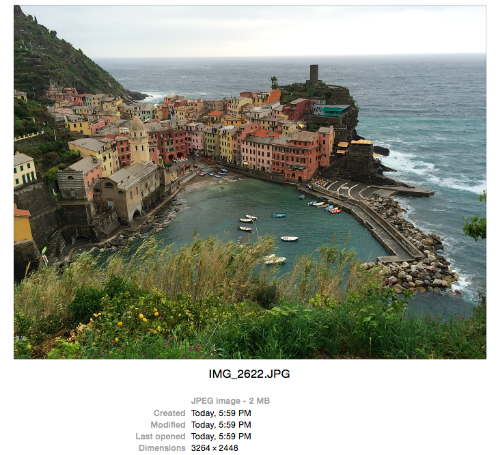 For an example image I'm going to use this photo I took on a recent trip. You'll notice the file is 2MB. I try to keep images around 50KB on my website depending on what I'm using the image for. So, you can see that 2MB is way too large.
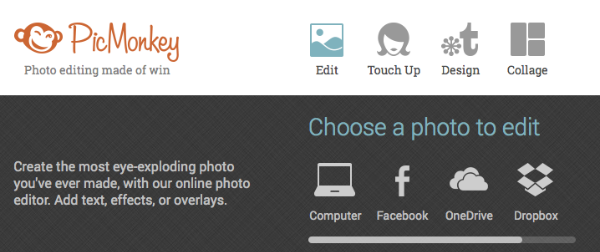

About Me
Web Design
Online Marketing
My "sweet spot" is helping small businesses and non-profits communicate their message in a way that gets results.
Craig Ludrick
Email
Latest Posts
Archive
Categories